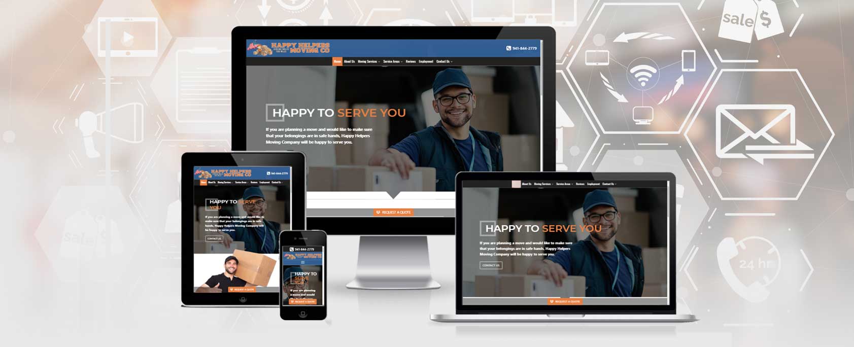
“Happy Helpers Moving Co” Website Redesign
Embarking on a transformative journey through website redesign, Rooks Agency‘s marketing case study delves into the strategic overhaul of a moving company’s online presence, aimed at achieving higher conversion rates and enhanced user engagement.
The Company
Happy Helpers Moving Co. is a professional moving company that provides local and long-distance moving services in Florida.
Unique selling points:
- The owner of the company and all company’s employees are military veterans who serve according to the highest moral standards associated with the United States Armed Forces.
- Exceptional customer care. The statement “At Happy Helpers Moving Co, we treat our customers like family” goes in line with the company’s name “Happy Helpers” and the slogan “Serving Smiles for Miles”.
Objectives
Redesign website to reinforce the brand image of the company, improve usability, and prepare the foundation for marketing campaigns.
Challenges
- The look and feel of the site. The site doesn’t convey the warmth and friendliness of its brand promise: ”We treat our customers like family”.
- Information organization. Unorganized, scattered throughout the website information can be confusing for visitors. Various web pages could be combined to improve usability and conversion potential.
- Inconsistent navigation. The link to the Phone number is shown only on the home page’s navigation area.
- Cite content: The “Our Services” section on the home page contains dozens of links to the cities in the State of Florida. The long list of links can reduce visitors’ attention and dilute their value for search engines and paid marketing.
- Call to action elements: The “Request a Quote” button was placed at the bottom of each page and required users to scroll down to find it.
- Forms. The “Move lead form” added to each “service” page may be confusing for the visitors. This form includes the standard “Contact Us” form fields and should be placed on the dedicated “Contact us” page.

Solution
Following the principle of user-centered design “Give visitors what they are looking for”, we implemented the following strategies:
Brand Reinforcement
We used the same elements of the well-established company’s brand: the color scheme, logo, and the tagline. To strengthen the brand message and the company personality we used the following strategies:
Using engaging and consistent imagery. The images of friendly technicians and happy clients with smiles on their faces create the “feeling” of a family-like environment and the special care provided by the company.
Using repeated elements: Placing a square box behind the heading elements and images of the moving boxes. Also, we include the images of the company’s cars with the logo wraps.

Site Structure Improvement
- We created a dedicated “About Us” page combining the content of the “Our Mission” and “Why us” pages.
- A ‘Service areas” was developed with the secondary pages that describe the service area details. This allows users to quickly find the desired area and view the services associated with this location.
- The Services navigation group includes a separate service category page. This improves usability and can result in conversions increase.
Call to Action (CTA) Elements Improvement
The “Request a Quote” button is set as the fixed element that sticks on the bottom of the screen when users scroll the page. This allows visitors to access the lead form and enter the conversion funnel from anywhere on the website.
Search Engine Optimization
Even before the website redesign, we conducted the keywords research to find those that have the highest search volumes and lower competition. Then we created a unique keyword list for each cornerstone page.
These keywords were used in the page titles, descriptions, text content, hypertext, image descriptions, etc.
Although the right choice of keywords is essential for search engine optimization, we follow the best practice: “Write content for visitors, not for search engines”.
Optimization for Conversions
The website architecture, the keywords categories, the quality of the landing pages, and call-to-action elements are equally important for the Pay-per-click campaigns.
One of the important steps we made for PPC marketing is to put the focus on service areas. Instead of repeating dozens of location names on each page, we have selected six major locations that receive the maximum searches. This allows the PPC algorithm to focus on areas that bring more traffic, more leads, and conversions. This strategy helps to better allocate the advertisement budget by preventing unqualified clicks and focusing on “in market” customers.
The Next Step
As the next step in our full-service marketing plan, we created a Pay-Per-Click campaign using the Google Ads platform and roll out a social media management plan for the company.
Results
Our amazing result rewarded the site redesign and our marketing effort. In one month after we launch the site and started the marketing campaign we have the following improvements:
IMPRESSIONS
+37.5%
INTERACTION RATE
+28.5%
CONVERSIONS
+1,360%
COST/CONVERSION
-65.18%
Summary
This case study illustrates the holistic approach we took to the website design. You can see how multiple components of our strategy reveal the bigger picture of the project. This approach empowers us to quickly identify problems and find solutions.
Is your website stagnant? Share your concerns and goals with us! Contact ROOKS AGENCY! WE WILL EXCEED YOUR EXPECTATIONS!